Look, I’m done with the pumpkin spice explosion every November.
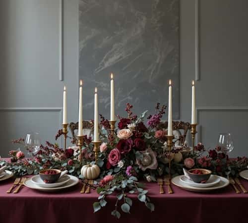
This year, we’re ditching those tired orange color palettes and going full cherry coded – think deep reds, burgundy tones, and a moody aesthetic that doesn’t scream “Pinterest mom circa 2015.”
Your Thanksgiving table deserves better than the same rustic fall decor everyone else is recycling, here are some of the best Cherry Coded Thanksgiving Tables decor that actually look good.
1. The Velvet Burgundy Foundation (Start Here or Regret It)
Forget those basic linen runners.
You need velvet table linens in deep burgundy or wine-colored fabrics as your base layer.
I’m talking about that rich, tactile material that catches light and makes everything else pop.
Lay a burgundy table runner down the center, then layer a sheer black or deep plum organza overlay on top – this creates dimensional depth without looking cluttered.
The contrast between matte and sheen is what separates a boring table from one that stops people mid-conversation.
Here’s where most guys mess up: they think one tablecloth does the job. Wrong. Layering textiles in varying textures (velvet, silk, raw linen in charcoal) gives you that sumptuous foundation that makes the cherry red aesthetic work.
I once saw someone use a single orange tablecloth. Once. We don’t talk about that Thanksgiving anymore.
2. Dark Floral Arrangements (No, Not Your Grandma’s Roses)
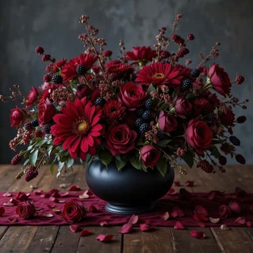
Deep crimson florals mixed with black foliage create that dark romantic vibe we’re after.
Hit up your local florist and ask for burgundy dahlias, chocolate cosmos (yes, they’re almost black), deep red garden roses, and dark calla lilies.
Mix in some burgundy ranunculus and wine-colored amaranthus that drapes down for movement.
But here’s the twist – add in blackberries on stems, deep purple scabiosa, and actual dark cherry branches with fruit still attached. The organic elements bring an unexpected edge.
Arrange these in matte black vessels or tarnished brass urns – nothing shiny or new-looking.
Keep arrangements low and wide so people can actually see each other across the table (basic hosting 101, but you’d be surprised).
I’m going for moody centerpieces that look like they belong in a gothic estate, not a craft store.
Don’t forget scattered petals in varying cherry tones and burgundy around the base. Botanical styling shouldn’t look perfect; it should look intentional but slightly undone.
3. Candlelight in Burgundy and Blood Orange (Maximum Mood)
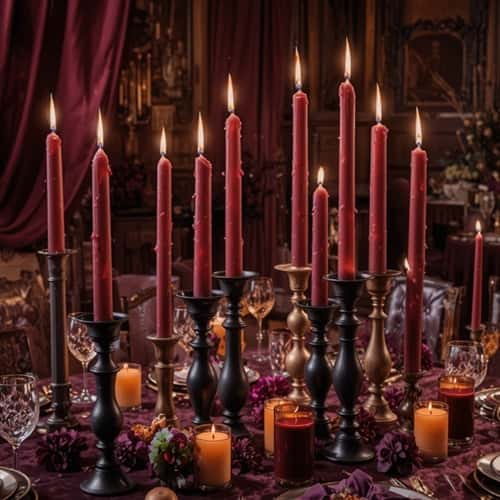
Taper candles in varying heights are non-negotiable for a moody holiday table.
Get burgundy taper candles, deep cherry red, and throw in some burnt orange tapers (the only acceptable orange here) in a 3:1 ratio.
Use black taper holders at different heights – brass candlestick holders that look vintage work too. Cluster them asymmetrically down the center of your table between the floral installations.
Add pillar candles in deep red and burgundy on the sideboard or side tables.
The key is creating ambient lighting layers – when you dim the overhead lights, this candlelit atmosphere transforms the whole space.
I’ve learned that warm candlelight against dark color schemes creates shadows and highlights that make everything feel more intimate and less “well-lit cafeteria.”
Pro move: get those battery-operated LED candles in burgundy for areas where real flames aren’t practical. Yes, I said it. Safety matters when you’ve got kids running around or Uncle Jerry getting too close after his third whiskey.
4. The Cherry-Stained Glassware Trick
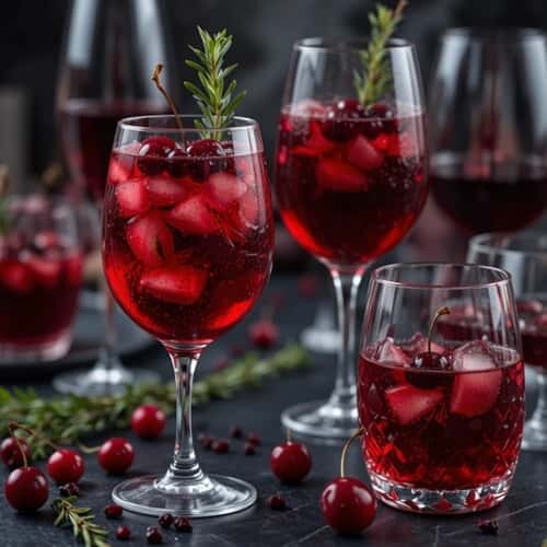
Here’s something nobody’s doing: colored glassware in the cherry aesthetic.
Track down burgundy wine glasses, deep red water goblets, or even smoke-tinted glassware with ruby undertones.
Mix them with black rimmed glasses or dark amber goblets. This glassware collection doesn’t need to match – actually, it’s better if it doesn’t.
The variation in glass tones and styles gives it that collected-over-time feel rather than “I bought a set at Target yesterday.”
Fill them with deep red wine (obviously), but here’s where it gets interesting: for a non-alcoholic option, make a cherry-pomegranate mocktail with fresh cherries and rosemary sprigs as garnish. The beverage presentation becomes part of your color story.
When light passes through jewel-toned glassware next to candlelight, you get this rich luminosity that’s pure magic. I’m not being dramatic – okay, maybe a little – but the effect is genuinely stunning.
5. Burgundy Napkins with Dark Metal Details
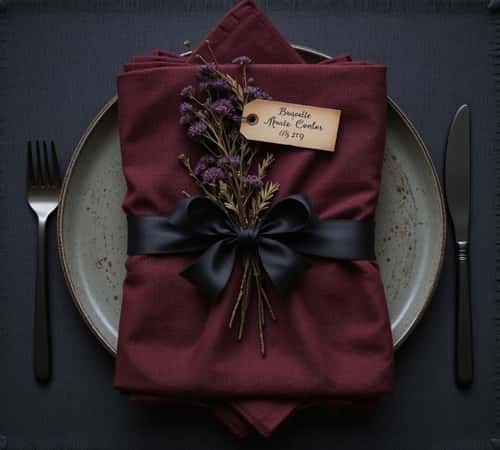
Cloth napkins in deep cherry or burgundy are your move here.
But don’t just fold them like a rectangle and call it done. Use black napkin rings made of wrought iron, or better yet, wrap them with dark velvet ribbon and tuck in a small sprig of dried burgundy florals or a single dark feather. The napkin styling should feel considered but not fussy.
I’ve seen people use wax seals in deep red pressed into black wax on the napkin fold – that’s next level decorative detailing if you’ve got the time.
Or tie them with black leather cord and attach a small name card written in gold or copper ink. These personalized touches make guests feel like you actually tried (because you did).
Textile choices matter more than you think. A high-quality linen napkin in burgundy beats a cheap polyester one every time. You can feel the difference, and so can your guests.
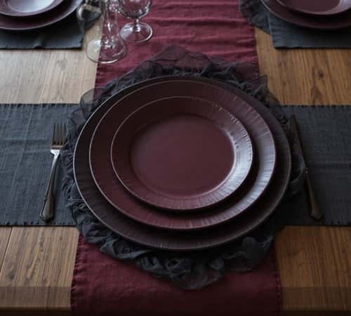
6. The Dark Place Setting Strategy
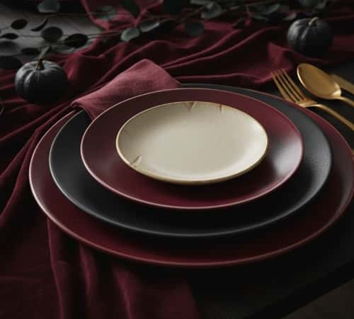
Charcoal dinnerware or matte black plates are the foundation of your place settings.
Layer a large charcoal or black dinner plate, then a smaller burgundy salad plate, and finish with a cream or ivory accent plate on top to break up all that darkness.
The plate layering creates visual interest and prevents the table from feeling too heavy.
Some guys go all black and wonder why it looks like a funeral – you need that light-colored accent piece to create contrast.
Gold flatware or black matte cutlery both work, but I’m leaning toward brushed gold silverware for warmth.
Add a wine-colored charger plate underneath everything if you want to go maximum impact. The dishware arrangement should feel substantial without being cluttered.
7. Cherry Branches and Dark Fruit Displays
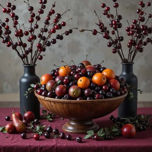
Real cherry branches (or faux cherry stems if it’s off-season) add literal cherry coded elements.
Place them in tall dark vases at different heights around your space – not just on the dining table.
Fill wooden bowls or black ceramic bowls with actual dark cherries, black plums, burgundy pears, and blood oranges. This fruit styling serves double duty as decor and post-dinner snacks.
The trick is making fruit displays look abundant but not staged. Let some fruit spill out onto the table.
Tuck in some dark ivy or burgundy grape clusters for that harvest aesthetic that doesn’t scream “basic fall.”
I’ve found that natural elements like this make the whole tablescape design feel less manufactured and more organic. Plus, if someone gets hungry before dinner, they’ve got options.
8. The Unexpected Black Lace Overlay
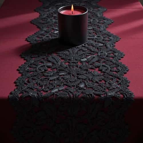
This is where you get bold with your burgundy Thanksgiving decor.
Find a black lace table runner or even a lace overlay panel and position it strategically over your burgundy velvet.
The lace detailing adds a gothic elegance that’s unexpected for Thanksgiving but absolutely works with the dark fall tablescape vibe. It’s delicate but not feminine – it’s dramatic.
You can also use lace doilies in black under candle holders or as coaster alternatives.
The pattern contrast between solid velvet and intricate lace creates visual texture that photographs incredibly well.
Just don’t overdo it – one lace element is statement-making, three is costume party.
9. Copper and Gold Accent Pieces (Warm Metallics Only)
Metallic accents in warm tones prevent your moody holiday table from feeling cold.
Scatter copper votives, brass candle holders, and gold-rimmed serving dishes throughout. Use copper flatware as serving utensils.
Place vintage brass candlesticks at varying heights. The warm metallics create a bridge between the dark colors and provide reflective surfaces that bounce candlelight around.
I’m not talking about shiny new gold – look for tarnished brass, aged copper, and antique gold finishes that have character.
The patina texture matters. These metallic details should look inherited, not purchased last week.
10. Dark Eucalyptus and Berry Garland
Seeded eucalyptus in dark green or silver dollar eucalyptus mixed with burgundy hypericum berries creates a garland installation that ties everything together.
Drape this along the center of your table between place settings, weaving through your candle arrangements and around floral pieces.
Add in some dark privet berries, burgundy holly, and chocolate cosmos blooms tucked into the greenery.
This botanical garland should look lush and slightly wild, not manicured.
The eucalyptus scent adds an aromatic element to your tablescape – sometimes we forget that sensory details beyond visual matter.
This foliage styling fills in gaps between your main elements without adding clutter.
11. The Moody Menu Card Setup
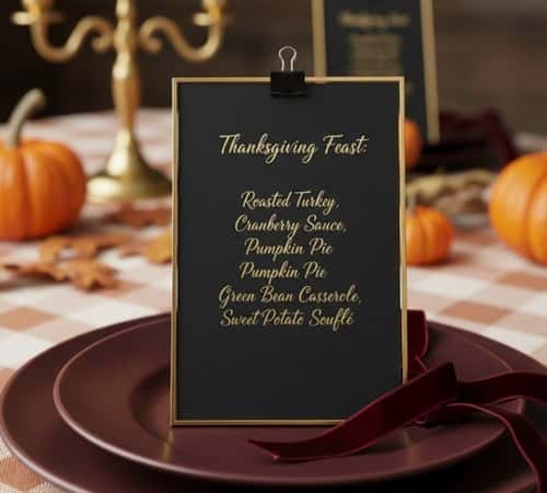
Handwritten menu cards on black cardstock with gold ink or burgundy calligraphy elevate the experience.
Place these at each setting or create one large menu display on a small easel at the head of the table. Include not just the food but the wine pairings or cocktails you’re serving.
This typographic element adds sophistication and gives guests something to anticipate.
You can DIY this – print in gold on black card stock, or hand-letter them if you’ve got decent handwriting (I don’t, so I’m printing).
Frame them in thin gold frames or clip them with black binder clips attached to burgundy ribbon. The menu presentation becomes part of the decorative scheme.
12. Black Tapered Candelabra (The Statement Piece)
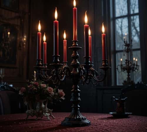
If you’re going to invest in one piece for your dark fall tablescape, make it a black candelabra.
I’m talking about a multi-armed candelabra that holds 5-7 taper candles, positioned as your centerpiece focal point.
Load it with burgundy taper candles and let it dominate the table. This single piece creates instant drama and gives you that gothic sophistication without trying too hard.
The candelabra silhouette against candlelight creates shadows and vertical interest that draws the eye up. It’s architectural. It’s bold. It says “I know what I’m doing with this moody aesthetic” even if this is your first attempt.
Final Thoughts
Your guests won’t remember the turkey. They’ll remember walking into a room that felt different – richer, moodier, like you actually gave a damn about the experience.
That’s what cherry coded does. Skip the typical fall clichés. Build layers, mix textures, trust your instincts.
When someone asks where you got your ideas, just shrug and say you wanted something that didn’t look like everyone else’s table. Because honestly? That’s the whole point.